The Challenges
Coinbase is a leading platform in the cryptocurrency market, but user feedback indicates that the mobile trading experience has some issues. Users often find the mobile trading interface visually cluttered and difficult to understand, creating friction when executing trades. Additionally, the portfolio interface lacks clarity, making it difficult for users to quickly grasp total balances, asset allocation, and growth trends.
Through user research, I identified two key areas that require immediate improvement: the portfolio interface and the trading interface:
-
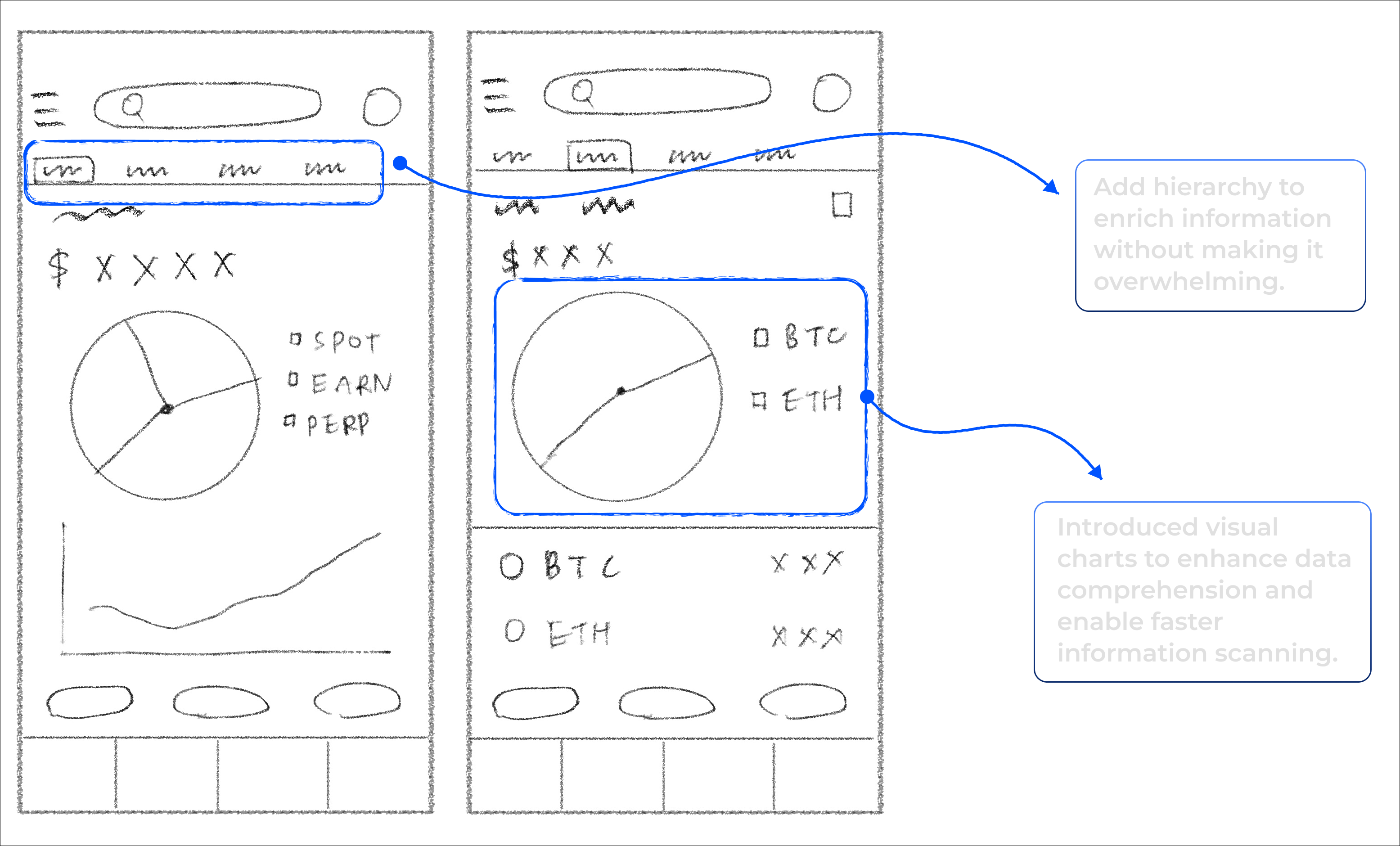
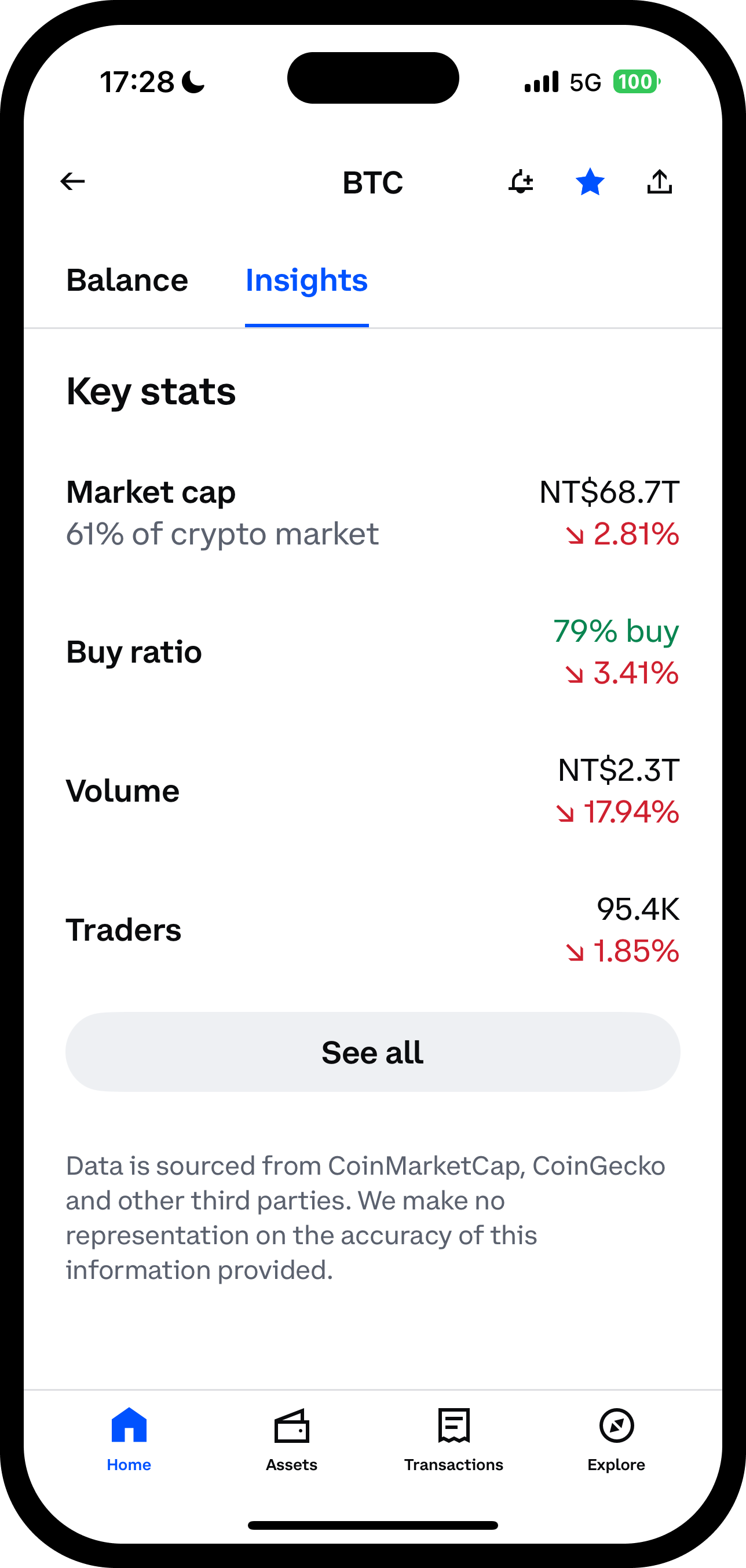
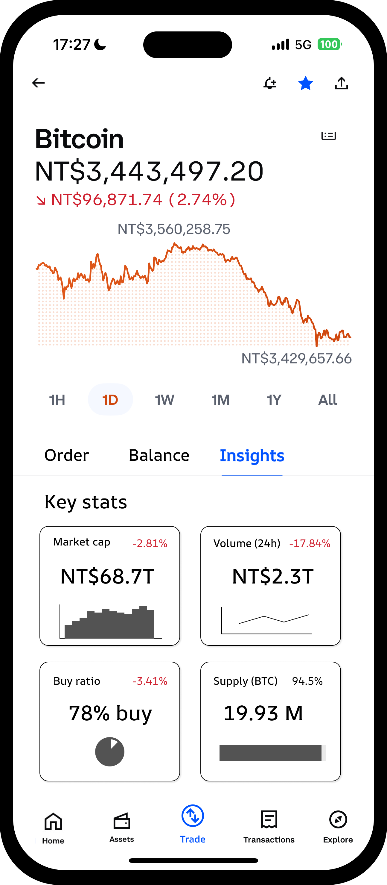
Portfolio Interface — Poor Data Visualization
• Lacks clear graphical representations (such as pie charts or trend lines)
• Difficult to quickly assess performance trends or asset allocation
• Low user engagement
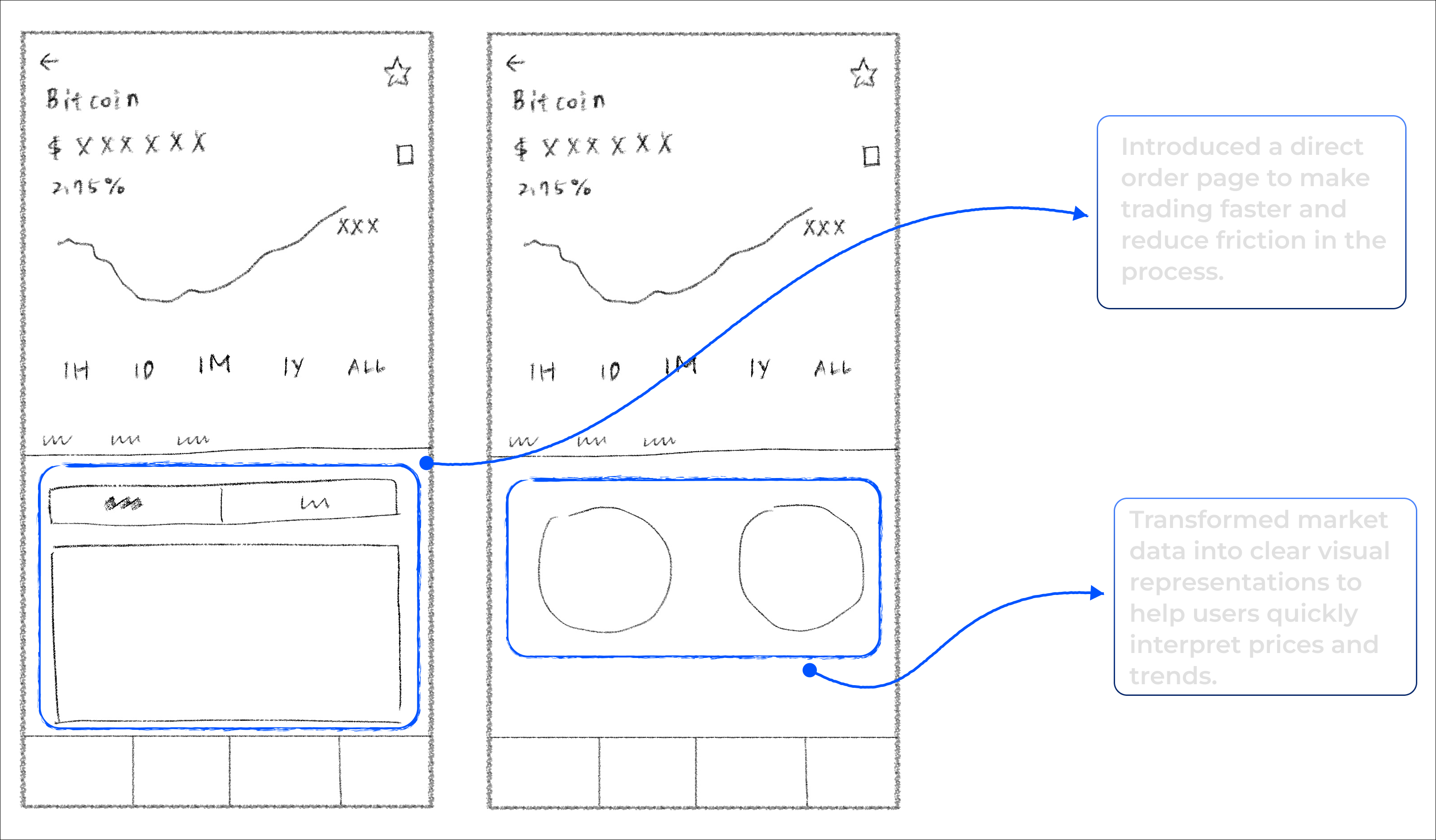
Trading Page — Unclear Entry Points
• Users often struggle to locate the order placement, requiring multiple attempts to find it.
• Users spend more time interpreting trading information.
As a designer, my task was to redesign the portfolio and trading interfaces to create clear visual hierarchy, intuitive user flows, and an easier-to-use trading experience, while maintaining Coinbase’s professionalism and credibility.
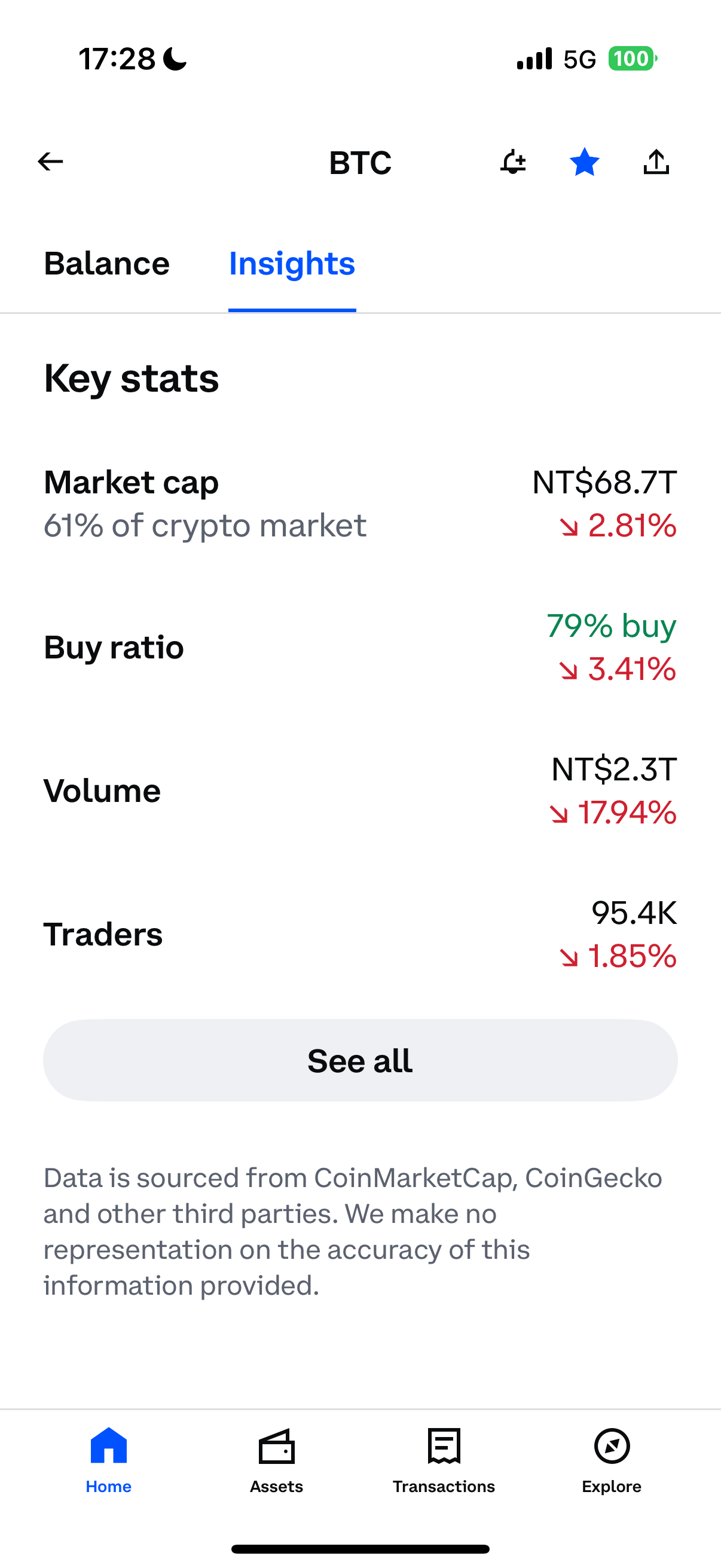
Portfolio Page — Poor data visualization
The current portfolio interface lacks hierarchy and visual cues, making it difficult for users to quickly understand balances, allocation, and growth trends, which reduces user engagement.
Trading Page — Unclear entry points
On the trading page, users cannot quickly place orders or interpret key market data, and some need multiple attempts to complete a trade.