Create harmonious palettes
in seconds

Graphic designers creating brand color schemes, or UI designers working on interface palettes, often need to ensure WCAG contrast compliance. Existing tools are usually scattered and cumbersome, requiring multiple apps and manual calculations. This makes the process slow, error-prone, and can lead to palettes that are either inaccessible or visually inconsistent.

I designed the Color Playground, a tool that simplifies the process of generating brand-ready color palettes while ensuring accessibility and usability.
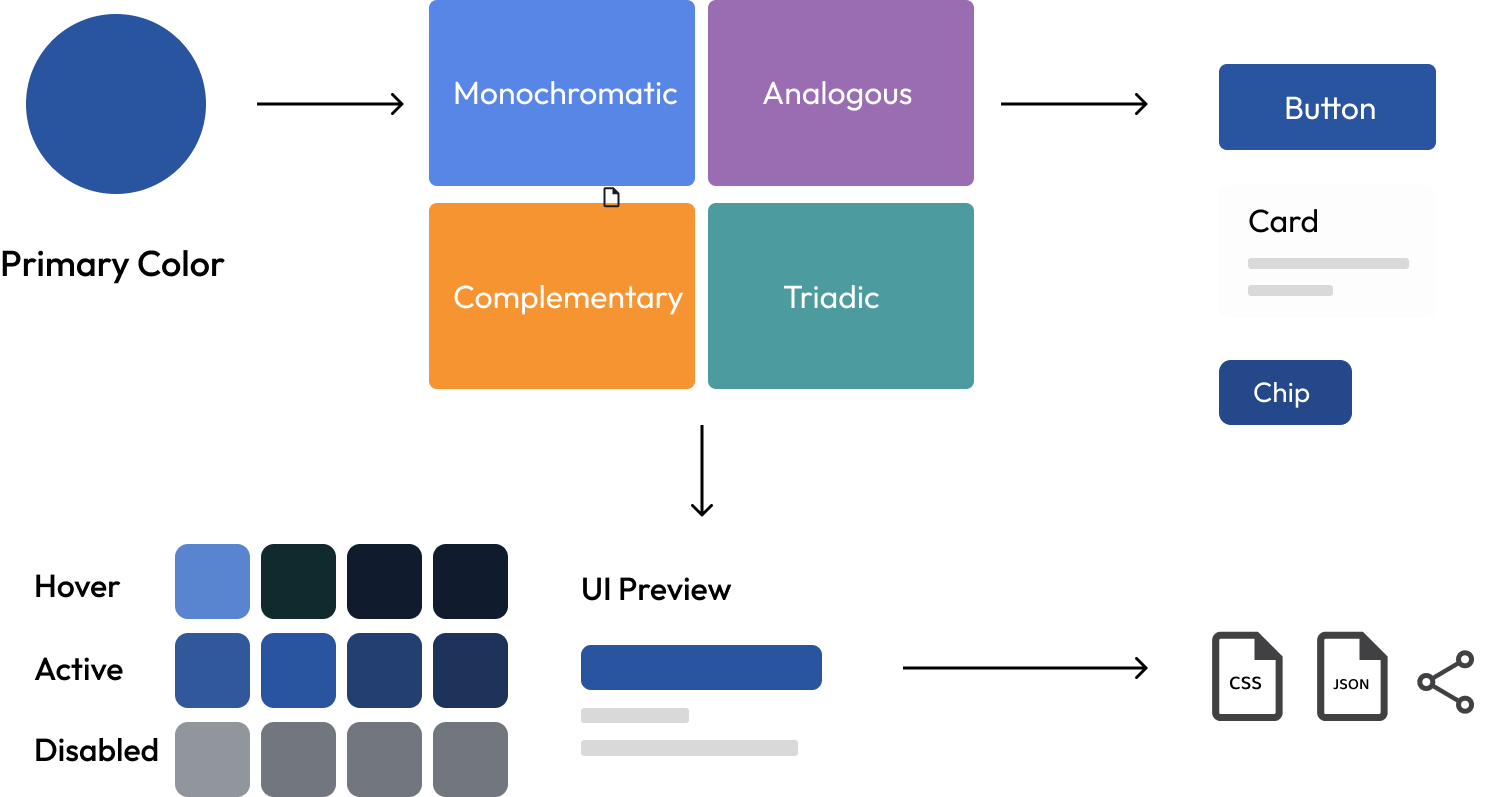
To inspire different palette directions, the tool includes four harmony rules:
This ensures designers can explore both safe and bold combinations.
Once the harmony rule is selected, the tool automatically generates a full palette including:
This saves designers from manually building out UI-ready palettes.
The system checks WCAG contrast ratios and highlights whether a color combination passes AA or AAA standards. This reduces the risk of accessibility issues later in the design process.


